
Wednesday, 30 March 2011
Tuesday, 7 December 2010
Evaluation!
1. In what ways does your media product use, develop or challenge forms and conventions of real media product?
For my foundation portfolio for Media Studies I was required to produce a front cover, double page spread and a contents page for a new music magazine. As it was a new music magazine that I had to create I wanted to challenge existing products, resulting in developing my own. However I did use current codes and conventions of existing products to assist me. I challenged existing products because from research I didn't like what was out there. I looked at NME, Q and Kerrang and realised that the content did not appeal to me. Therefore I had to create a magazine that did appeal to people of my age. Through my own primary research questionnaire I found that the majority of people I surveyed were aged between 16-20 and the results influenced my idea of creating a magazine that was aimed at my age range even more. I found that when I looked at Top of the Pops magazine I felt that I should produce a magazine that was an older, more mature version of this as it had stories about pop stars but not about music itself. My target audience enjoy pop music but they like scandal, gossip, fashion and celebrity news. I know this because of my questionnaire results and also because of my own preferences.
My music magazine uses, challenges and in some parts develops forms and conventions of real media products. My magazine uses the conventions of a real magazine product as I have used the same layout as the standard magazine would. I choose to use these conventions because I wanted my magazine to fit in with other magazines that would be on the shelf with it if it were to be sold in the shops. I think I have done this successfully as every thing has been positioned in the ‘correct’ places on the pages. The front cover background picture has developed conventions of my music magazine from others which are aimed at lower teens. Having the bricks on the background behind the subject develops the conventions because it shows that it is for older teens and ‘harder’ women. My media product challenges the conventions on the contents page because on the front cover I have used bricks as a background and on the contents page I have created I have put the titles in a soft pastel colour, so they are two totally different things. It also uses the conventions because I have an editorial, a title and page names with a number next to them in different sizes as some current magazines would.
2. How does your media product represent particular social groups?
My magazine represents the social groups that are the same as the pop star, ‘Blake’ on the front cover. She is a young role model for people of her age and below because she is a ‘famous’ pop star, people want to be like her and wear the clothes she is wearing, for example. She represents the social groups by what she is wearing in the pictures and the story line on the double page spread is realistic and may have happened to a person of her age and social group which would encourage them to buy this music magazine product.
Social groups have been divided in to categories, they are: A, B, C1, C2, D & E. A and B being the highest classes having people in them who are doctors, lawyers and managers, for example and D and E being the lowest working class. C1 and C2 people are in the middle, so C1 jobs are likely to be people who are going to work their way up, like a junior manager, for example and a C2 person is known as a tradesman or manually skilled labourer. C1 jobs are also known as ‘White Collar Worker’ and C2 jobs are also known as ‘Blue Collar Worker’. My magazine that I have produced is aimed at C1 and C2 classed people. I think that I have successfully targeted my target social group because of the content that is in the magazine and the common ‘buzz’ words that I have used.
The register of my interview with ‘Blake’ is very informal and chatty, as I have used words like, ‘Hmmm about your fans…’, ‘Sure, so how is your tour going?’ and ‘Yes Christmas is coming! We love Christmas here at Out Loud!’. These words and phrases is very informal and would be the way that people of my target audiences age would use.
3. What kind of media institution might distribute your media product and why?
The media institution that might distribute my media product would be IPC media because they are a publishing company that prints magazines that are similar to the one that I have produced that are targeted at up market women. A specific branch of IPC Media that publishes women's magazines that are about fashion and womens lifestyle and is called IPC SouthBank. They publish magazine such as Pick Me up, Heat, Now, Look, What’s On TV and Women’s Own. IPC media distributes and sells 350 million copies of the magazines that they produce and print every year. They produce over 85 iconic media brands, such as the ones I have named above, they reach almost two thirds of the women in the UK and 44% of men in the UK.
IPC SouthBank publish a magazine called Marie Claire and it is now distributed in 36 countries due to IPC SouthBank's success. The magazine has some serious and fun parts about it.
I think that IPC SouthBank media would be the right publishing group to publish my magazine because it is a successful company and publishes magazines of a similar 'genre' to mine.
4. Who would be the audience for your media product?
The audience for my music magazine, Out Loud!, would be female students, mature students and people in the C1 and C2 class, these people would be aged between 16 and 20. I think that I have successfully met my target audience’s needs by producing a magazine that they would be interested in by carefully choosing the words and by having a double page spread title that may apply to some readers. The artist, ‘Blake’ that is featured on every page that I have produced for my magazine is very current and ‘cool’ and people of my target audiences age look up to her and try to copy her style and most of all they love her music, which is what this magazine is meant to be about.
The use of my made up television programme ‘Pop Mania’ on the contents page is meant to be a similar programme to the ‘X Factor’ which is currently on television now and people watch it in their millions, especially teenage girls of 16-20. so by doing this my target audience’s needs have been satisfied and they are given a magazine that appeals to them and that is current.
5. How did you attract/address your audience?
I attracted and addressed my audience in a way that I would want to be attracted and addressed towards a new magazine. I did this by making an interesting, bright and attractive front cover, as the front cover is the first thing you see when you pick up a magazine, first impressions are everything and the story lines that are on them, I think, work very well and I’d want to read them if I saw the magazine in the shops.
I addressed my audience quite informally because teenagers talk this way and I wanted the magazine to represent them. If I addressed them formally they may have a view on the magazine where they think its ‘posh’ and they may chose not to read it. So I addressed my audience as I would like to be addressed by a magazine, and the way the pop star on the front would be addressed/talk to other people as I wanted it to represent the people who read it so they can relate to it being like them.
The buzz words that I have used attract my audience, for example, on the double page spread I have used ‘break up’, this is on the little short explanation above the interview where it tells the reader what it is about. It is written in capital and little letters alternately. This represents her life and suggests that her life is upside down. Also in this part above the interview, the first few words are, ‘Blake tells Out Loud! her story…’ this shows that she is confiding in Out Loud! so she can at least get one ‘person’ on her side about the rumours that have been going around about her and Ryan.
I have used the word ‘b*tch’ in the title of the double page, this is a phonetically harsh word and it can also make the reader to feel sorry for the pop star. ‘Honest’ is another word that I have used in my title for the double page spread, it shows that the artist is truthful and not hiding from anything. The mise-en-scene for the picture on the double page spread is that I have decided for the subject to be wearing red lip stick, I chose a subject who had blonde hair as this is quite a soft colour and the guitar, which is related to music which is the theme of my magazine, also symbolises masculinity, along with the ‘hard’ brick wall. My editorial on my contents page is very girly, personal as I have ‘signed’ my name and it directly addresses them. The colours that I have used for the double page spread are red, black and white. White is the colour of purity and symbolises innocence, red is the colour of power and dominance, which is what I wanted my subject to be, and black symbolises power, elegance, death and evil, although the subject is not actually wearing any black, it’s the text only that is black as I thought that it would be a suitable colour to write in.
6 and 7
6. What have you learnt about technologies from the process of constructing this product?
7. Looking back at your preliminary task, what do you feel you have learnt in the progression from it to the full product?
When I first started this course I was required to make a front cover only for a school magazine as a preliminary task. To do this I used Photoshop for my final school magazine product and Microsoft Publisher for the construction and layout planning for my blog. I learnt an exceptional amount from my preliminary task of the school magazine and I feel that it helped me a great deal for the final music magazine product. The preliminary task seemed to be difficult to being with because of all the software programmes that I was required to use but once I had begun to use them and get used to them it became easier. My school magazine front cover helped me to begin to grasp how to use Photoshop,which i used for my front cover.
When I first looked at Photoshop it looked really difficult to use and confusing as to what different tools and symbols did and meant, now I have learnt how to air brush things out on Photoshop, I have learnt the concept of using layers in Photoshop and when to add new ones whereas I did not know this before. Cutting out ‘Blake’ from photos on Photoshop became easier as I did it more and more as I did have numerous attempts at it to get it right to put on my double page spread. I have recorded on my blog when I have edited photos and you can see a before and after picture of this. As I hadn’t used Microsoft Publisher a lot before this course my skills for that programme have grown too. I now know how to change the paper size and layout to get it the size I required (A3 & A4) for my double page spread and my contents page.
When I had completely finished my front cover, double page spread and contents page, I was advised to transfer it all into a PDF document. In order to do this I had to transfere everything into a programme called InDesign. InDesign is a professional software programme that is used so that you can see what your magazine will be like as a rough guide. I had to copy my front cover from Photoshop into InDesign, and my doubel page spread and contents from Microsoft Publisher. As InDesign and Photoshop are from the same company (Adobe) the front cover was easy to copy/ transfer over into InDesign as I did not have to format any text. When I copied my Double page spread into InDesign from Publisher I had to copy each text box individually and change the text size and font, which took me quite a while. I then exported them all into a PDF (Portable Document Format) document. I had to use bleeds and crop marks in InDesign so they could be seen on the PDF document for the 'printers'. All the colours that I have used can be seen in the top left and right hand corners of each document. As you can see below:


Final front cover, double page spread and contents
 I have now decided to put my front cover and double page spread into InDesign so I can easily transfere them into a PDF document.
Here is my Front cover in InDesign, to transfere it into a PDF document I followed the following steps:
File ->Export -> saved it as a PDF, I did this for my double page spread too.
For this I have used the professional software programme called InDesign. This is a software programme that is professional enough to produce books and magazines that are sold in the shops. So this is why I have decided to use this programme. The previous post when I did my double page spread on Microsoft Publisher is now my planning for InDesign, I did not plan to put my double page spread into this programme to begin with until I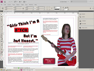 was advised to. Due to the transfer process from Microsoft Publisher you can see, that the last column of writing has been moved. Due to the transfer between Publisher to InDesign I had to put the last column onto the top right hand side of the right hand side page, to give me more space.
 was advised to. Due to the transfer process from Microsoft Publisher you can see, that the last column of writing has been moved. Due to the transfer between Publisher to InDesign I had to put the last column onto the top right hand side of the right hand side page, to give me more space.
Also the title 'Girls Think I'm A B*TCH But I'm Just Honest' has been changed as I have edited it in Photoshop to give it a 'drop shadow' and slight 'outerglow', and the word 'B*ITCH' has a red background and another 'dropshadow' so it stands out more.
 This is my contents page on InDesign. I decided to transfer everything from Microsoft Publisher into InDesign to make it possible to make it into a PDF document.
I then decided to export it to a PDF document as this is what it would be sent to a publisher in. The screen shot to the right is my double page spread in the PDF programme. All the colours and shades of black that I have used can be seen in the
top left and right hand corners of the pages. This is an indicator of all the colours that are needed to print this double page spread for the publishers/printers.
Thursday, 25 November 2010
Music magazine - Contents page completed

This is my contents page for my music magazine. Here I have changed the layout from my original layout design in the below post. I have decided to use the word 'welcome' instead of 'contents' because it is more friendly and informal. The editorial on the contents page is very informative about the magazine, it tells the reader what other great stuff is included in the magazine. I have used lots of 'buzz' words that would appeal to women of my age. A quote from the text would be, 'We've also got exclusive behind the scene, never been seen before pictures of Vanessa's fashion range which will be launched next month'. The bold words are 'buzz' words that tell the reader what this particular story is about. Another quote would be, ' Don't forget to check out page 39 for the latest scandal and gossip from Pop Mania.' Pop Mania is meant to be a music talent show that is similar to the X Factor, which is something that people the age this magazine is targeted at would watch. Another quote which is a story that is on the front cover would be, 'Oh and girls... lock up your boyfriends because HOT Pics of A.C.E are UNLEASHED! Phwoar! Again the bold words are the 'buzz' words. Underneath that I have put 'Love and Kisses... Chloe X.' This is a personal touch to the editorial paragraph and is a good ending so the reader can enjoy the rest of the magazine.
I have used a title for a set of page numbers in the top right hand corner that says 'On the cover', this is surrounded by a light purple/violet box, this goes against the idea of being 'hard' because of the brick wall in the background on the front cover as violet is a soft colour.
I have decided to put a picture of 'Blake' on the contents page because I wanted to show here dominance of the pop star further if she is on every page I produced for the magazine.
In the bottom left hand corner I have got the important pages of music news that is featured in the rest of the magazine. I have named it 'News Beat' as I felt that the word 'beat' is helping me to keep to the music theme as well as the stories that are listed underneath. 'News Beat' is written within a pastel yellow coloured box, again this is a soft colour and goes against the 'hard looking' brick wall. The stories are (buzz words are written in bold): 'Vanessa's new fashion range', which I wrote about in my editorial, 'Whats hot and whats not in celebrity music news', Melody's big come back... is she for real?, 'And have a sneak peek at next months issue'. All these stories are music related as 'Vanessa' is meant to be a popular solo artist that has released a new fashion range, her fashion range being clothes that are aimed at women who are of the age range of who would read the magazine that I have produced.
I have put the numbers of the pages in a pink/purple coloured boxes and they are all of different sizes, including the font size of the numbers. I think that this is effective as it is an unusual way of having the numbers displayed on a contents page.
Music magazine - Double page spread final planning

This is my double page spread for my music magazine. I have decided to put a star as a replacement for the 'I' in the word 'bitch' because I felt that it may be a bit to 'strong' for younger readers. There is a box next to the subject that gives details of her new album release which she talks about in the interview.
The text that would normally be red (the questions that 'Out Loud!' ask) are black because in order to get a complete screen shot of the whole 2 pages I had to use the print preview option and the printed that is linked up to the computer that I'm using is black and white.
I have now put page numbers in the top left and right hand corners, this makes it look as if it is really part of the magazine and is not just the first 2 pages.
I have used a range of fonts, they include:
Bauhaus 93 at size 100 and 150 (for title)
Arial at size 14, 11 and 10 (for the interview)
Elizajane at size 18 (for Out Loud!)
National primary at size 16 (page numbers)
I have also changed the photo that I have used for this page, it is different to the one that was previously on the double page spread and it is in a below post. I changed the picture because when I cut it out it had 'rough' edges and didn't look 'smooth' and professional. For this picture I had to cut out the piece of wall that was in between the subjects arm and hip which I had not previously done. Here the subject is looking away, I think this is good as it can relate to her looking away from her so called 'fans' as they think badly of her because of all the 'lies'.
Wednesday, 24 November 2010
Contents page - layout (pre production)

This is my contents page layout. It is very brief as unfortunately I became limited on time. I think that the layout may change when I come to do my final contents page. The different coloured boxes indicate where each element of the contents page will go. I think that it is important for me to write an editorial paragraph as it will make the magazine more personal to the reader.
Monday, 22 November 2010
Double page spread - almost Complete

To do this I used Microsoft Publisher. I am not sure at this moment in time as to whether it would be a good idea to upload it to Photoshop as it is not a publishing programme and there is no reason for doing this. I stuck to my plan and did not change anything that said I would do. I think that the red box around the word 'BITCH' is incredibly affective and stands out. I have used the same font as I did for my front cover titles (not magazine name). I think that the picture of 'Blake' is very affective, it looks like she is coming out of the page and is dominant and not affraid to say the truth.
Subscribe to:
Comments (Atom)