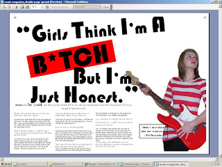
This is my double page spread for my music magazine. I have decided to put a star as a replacement for the 'I' in the word 'bitch' because I felt that it may be a bit to 'strong' for younger readers. There is a box next to the subject that gives details of her new album release which she talks about in the interview.
The text that would normally be red (the questions that 'Out Loud!' ask) are black because in order to get a complete screen shot of the whole 2 pages I had to use the print preview option and the printed that is linked up to the computer that I'm using is black and white.
I have now put page numbers in the top left and right hand corners, this makes it look as if it is really part of the magazine and is not just the first 2 pages.
I have used a range of fonts, they include:
Bauhaus 93 at size 100 and 150 (for title)
Arial at size 14, 11 and 10 (for the interview)
Elizajane at size 18 (for Out Loud!)
National primary at size 16 (page numbers)
I have also changed the photo that I have used for this page, it is different to the one that was previously on the double page spread and it is in a below post. I changed the picture because when I cut it out it had 'rough' edges and didn't look 'smooth' and professional. For this picture I had to cut out the piece of wall that was in between the subjects arm and hip which I had not previously done. Here the subject is looking away, I think this is good as it can relate to her looking away from her so called 'fans' as they think badly of her because of all the 'lies'.
No comments:
Post a Comment