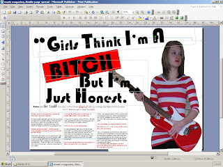
To do this I used Microsoft Publisher. I am not sure at this moment in time as to whether it would be a good idea to upload it to Photoshop as it is not a publishing programme and there is no reason for doing this. I stuck to my plan and did not change anything that said I would do. I think that the red box around the word 'BITCH' is incredibly affective and stands out. I have used the same font as I did for my front cover titles (not magazine name). I think that the picture of 'Blake' is very affective, it looks like she is coming out of the page and is dominant and not affraid to say the truth.
It looks really good, but theres still wall in between the subjects right hand and hip. :)
ReplyDeleteaha! cheers.. and yh i know.. its not quite finished yet :P
ReplyDelete