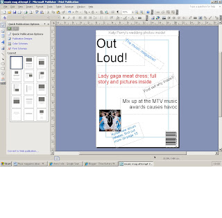
This is my second attempt on making my music magazine, this time I have used text and one picture; the pircure is of Kylie Minogue's album cover, I did not take this picture and I will not be using it for my final peice. I have done this so it can help me decide on where different peices of information should go. I have put some peices of writing on the angle for a bit of affect so it is not boring! At this point I have decided to use 3 main clours for my text, Blue, Black and Red although these may not be the final colours that I will use for my final front cover. I think that black is a bold colour and will stand out against a light background, so depending on my picture I may not use this. Black is also associated with death and power so it may not be a good idea to use this colour. Red is a colour that symbolises danger and is a bright vibrant colour that stands out to all eyes! Red is also a highly emotional colour and it stimulates secision making, so this colour may be a good one to use for may final peice because people may decide to buy the magazine if it was to go out in the real world. Blue is considered to be beneficial to the mind and body as it produces calming affects. Blue is also a masculine colour, so as my magazine is aimed at females I will have to do research on whether or not it would be a good idea to use or not. I do not have a picture that I have taken myself yet to put as a background.
No comments:
Post a Comment