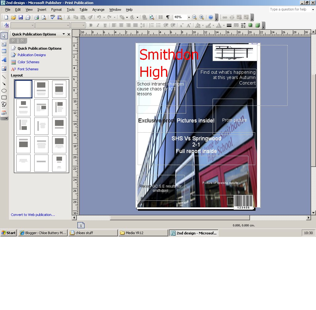
For this attempt I used the picture as my background and used white writing on the dark parts to show 'up'. I now have my 3 main colours that im going to use, Red, White and Black. I think the picture as the background looks better because it is more appealing and eye catching to look at, rather than having a plane background with a small picture on.
Chloe excellent use of screen shot to show your ideas developing. Try to comment about your ideas in more detail. Why have you decided on red, white and black? Do you associate these colours with anything? Remember every decision you finally make will need to be evaluated in detail. Fantastic work, I am looking forward to seeing your ideas for your original image for the school magazine.
ReplyDelete